
Choosing a Color Palette
Due to the amount of times that people write and ask about my color palette, I decided to write a blog post on the subject.
I will try to keep this as simple as possible, but when talking about color choices there are so many factors to consider and variables, well, that I fear that this post may be a bit long. I will do my best to keep it simple.
I am not a color expert, scientist or alchemist, but have experimented over the past 9 years here in Italy and found that these colors work best for me in my particular situation.
I like to keep it simple and use a palette of primary colors. On the surface this seems like a potentially limiting choice, but I can assure you that the possibilities of mixtures with this palette are endless and I have yet to explore all the possible ranges.
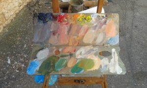
my palette after having finished a day’s painting
To be more specific I use a double primary palette, including a warm and a cool of each primary color. I do this simply because it expands on the range of mixtures in both the warm and cool, which are essential to creating depth and distance in landscape painting.
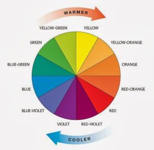
Photo courtesy of Ryli Jo Designs
To be clear and to make things simple (remember, keep it simple!) warm colors refer to anything moving towards yellow or red. You can think of fire here.
Cool colors refer to any color moving towards blue. Picturing ice helps here.
Every color, say even yellow, can have a warm and cool variation.
Warm colors tend to come forward in our vision when we look at them while cool colors tend to recede back into space. White or any incremental addition of white into a mixture adds to the cooling of even the warmest color.
Take the example below of these bright red and pink buildings. All warm colors and coming forward towards you in space and giving you the strong sense of the hot Roman sun.

Through the Red Arch, Garbatella
12 x 10″
Oil on Paper, mounted
While this painting below was painted on a rainy day and showing a fair amount of distance, meaning I had to mix cooled and grayed colors. Same palette, same colors, just different mixtures.

Spring Rain, Parco degli Acquedotti
11 x 14″
Oil on Linen Panel
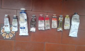
I will list the exact colors that I use on my palette, although sometimes they may vary, these are the staples:
Titianium/Zinc White mixture
Cadmium Yellow Lemon
Cadmium Yellow Light
Cadmium Red Light
Cadmium Red Medium
Alizarin or Madder Lake Deep
French Ultramarine Blue
Prussian Blue
Transparent Brown or Red Oxide
The one non primary color, transparent oxide red or brown I use primarily just to deepen shadows and never use any black. (black is useful in what has now become known as the “Zorn palette” and is a great combination with yellow ochre in mixing greens as it is very blue in nature)
Here is a picture of the colors on my palette in their tubes:
I’ve done a lot (and still do, it’s never-ending..) of switching up brands depending on the color. As you can see I rely heavily upon the cadmium colors, as they give the most bang for your buck if you will and are essential to me in creating lively and vibrant paintings in capturing the strong light effect here in Italy.
It is essential to never skimp on paint quality, even if it is more expensive than you think it should be. It’s expensive for a reason and worth every penny. You will find that certain manufactures make a color that you prefer and that no 2 are ever the same. We have our work cut out for us!
With all of that said, every painter must and will experiment with adding and subtracting colors and never getting too comfortable with just any set color combination. Sometimes there are subjects that you need different colors for, especially in still life painting.
In the end though, in the style of painting that I have chosen which focuses primarily on the quality of light and shadow, the main concern is always getting the values relationships relating to each other correctly. In other words having the dark shadows recede and the lights come forward to create a sense of light, space and air. This can be done with any infinite color combination, including just black and white. Keeping this in mind leaves the painter free to experiment with their colors.
I hope that you will have more questions and comments of your own about what you find works best for you painters and what any part of this means collectors and art admirers.
Thanks to everyone who has engaged me in one of the most important conversations in painting, that of color.
Caroline Gilbert
March 27, 2014 at 8:46 pmThanks Kelly, really good explanation, and especially warm colours (fire) and cool colours (ice).. it’s a good way of remembering. Roll on Umbria. Best wishes, Caroline.
Kelly Medford
March 28, 2014 at 9:39 amHi Caroline and you’re welcome for this explanation. I remember studying warm and cool in art school and for some reason it all seemed so convoluted. Then when I had this ice and fire metaphor to think about it became easy not only to remember but to see in individual colors.
Thanks for your comments!
Kelly
Helen K. Beacham Fine Art
March 27, 2014 at 11:29 pmGreat, succinct explanation, Kelly. And especially where students need to understand that adding white immediately cools down the color!
Kelly Medford
March 28, 2014 at 9:37 amOh thanks Helen and I don’t want to seem to silly simple in my explination, but just give the basics of what is behind my color choices.
But for watercolors, now that is a whole other world! Just yesterday I was watching some short videos of Charles Reid and specifically looking at his palette, which made me think of you. Nice to have a whole other way of thinking about white too!
Happy painting,
Kelly